Cost pyramid around goal?
Hi again,
//edit: question might be obsolete, see my first comment for reason
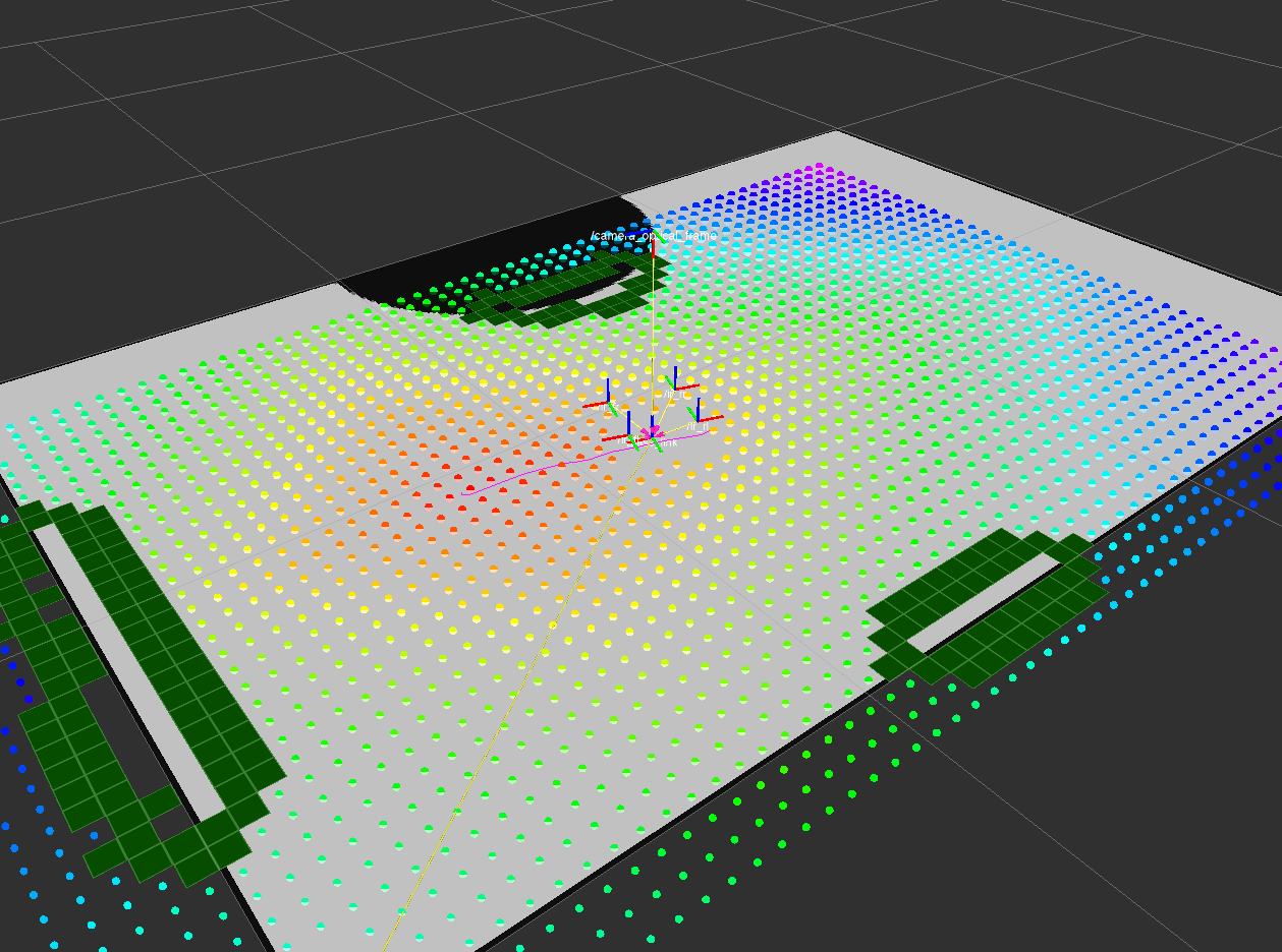
I'm just examining the local costmap of my robot. After giving it a 2D goal in rviz I see kind of a cost pyramid around the goal with the goal on its tip. That makes the robot struggle with getting to the goal as cost goes up the closer the goal gets.
Is that the usual behaviour of the costmap? If it is, what's the reason for this?
In rviz the cost pyramid looks like this, where the current goal is in the middle of the red area: 
Thanks!
Cheers, Hendrik
PS: it might be that I've not yet understood which cost indication color is low and which is high, but I assume red is high and violet is low. Correct me if I'm wrong.


